Case Study: SQL Queries & Geospatial Visualization
I recently completed a case study as a second round interview for a startup based in NYC. The Objective was to confirm my ability to effectively query a SQL database and also show my ability to create a dataframe in Python and plot pertinent population data geospatially.
If you’re interested in looking under the hood you can see the code I used to complete the challenge here.
First up, SQL queries
Querying a SQL database and utilizing basic aggregate functions are fairly straightforward tasks. One could easily learn how to complete these queries through any of a number of free online tutorials. Window Functions aren’t as straightforward. A more advanced feature of SQL, Window Functions allow you to perform aggregate functions on a subset of data and often allow you to do so in a way that optimizes computational performance. One might utilize a Window Function in SQL when looking to calculate a moving average over a specific time frame.
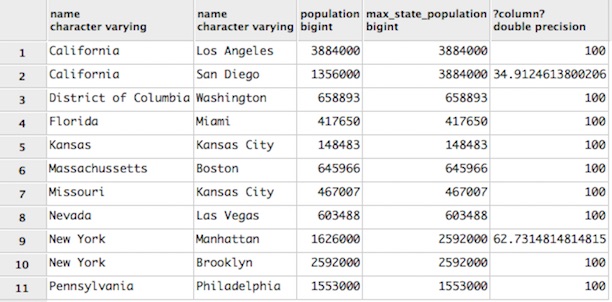
One query in this case study was employed to: “calculate the percentage size of the city relative to the city with the largest population in the state.”
SELECT states.name, cities.name, cities.population, MAX(population)
    OVER (PARTITION BY state_id) AS max_state_population,
    (CAST(population AS float) / (MAX(population)
    OVER (PARTITION BY state_id))*100)
FROM cities
JOIN states ON states.id = cities.state_id
ORDER BY states.name;
Python Dataframe and Geospatial Visualization
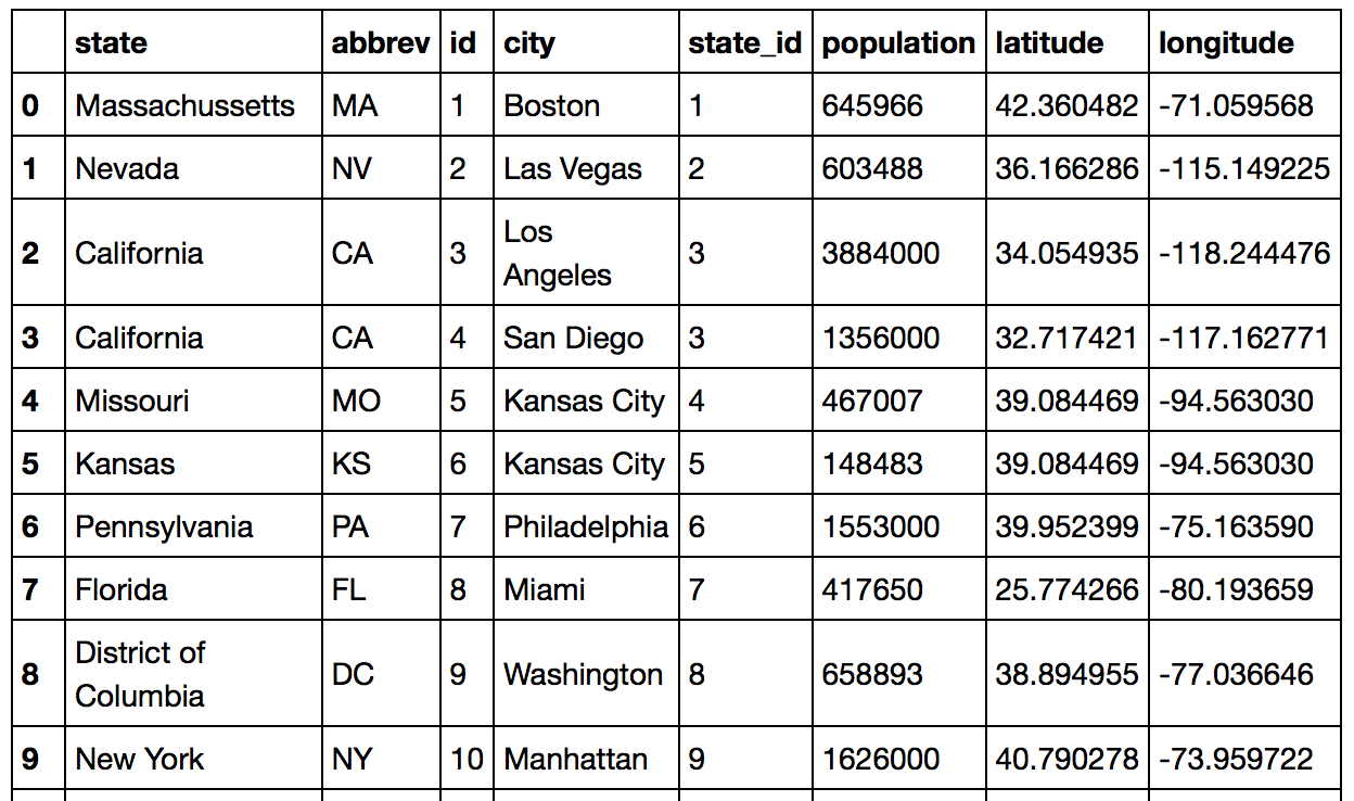
Next, I connected to my local SQL database in Python to create a dataframe in Python with the goal of:
Determining Longitude and Latitude of all cities and inserting these into dataframe
I did this by creating a basic function to look up the latitude and longitude for a list of values using geopy. I inserted the resulting lists back into the dataframe and then plotted populations of active cities.
from geopy.geocoders import Nominatim
lat_list = []
long_list = []

def LatLong(values):
    for x in values:
        geolocator = Nominatim()
        location = geolocator.geocode(x)
        lat_list.append(location.latitude)
        long_list.append(location.longitude)

cities = df['city'].tolist()
LatLong(cities)
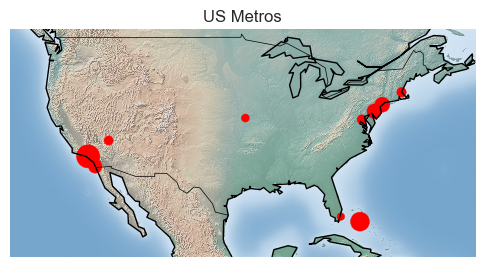
Plotting population on maps via a point with size relatively to population.
from mpl_toolkits.basemap import Basemap
import matplotlib.pyplot as plt
import numpy as np
m = Basemap(projection='mill',
llcrnrlat=20,
llcrnrlon=-130,
urcrnrlat=50,
urcrnrlon=-60)
m.drawcountries()
m.drawcoastlines()
lon = df['longitude'].values
lat = df['latitude'].values
size = df['national_population'].values
xs, ys = m(lon, lat)
m.scatter(xs, ys, marker = 'o', color = 'red', s=size*1000)
m.shadedrelief()
plt.legend
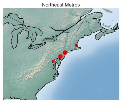
plt.title('US Metros')
plt.show()
m = Basemap(projection='mill',
llcrnrlat=20,
llcrnrlon=-130,
urcrnrlat=45,
urcrnrlon=-110)
m.drawcountries()
m.drawcoastlines()
lon = westcoast['longitude'].values
lat = westcoast['latitude'].values
size = westcoast['westcoast_pop'].values
xs, ys = m(lon, lat)
m.scatter(xs, ys, marker = 'o', color = 'red', s=size*500)
m.shadedrelief()
plt.legend
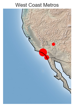
plt.title('West Coast Metros')
plt.show()
m = Basemap(projection='mill',
            llcrnrlat=30,
            llcrnrlon=-90,
            urcrnrlat=50,
            urcrnrlon=-60)
m.drawcountries()
m.drawcoastlines()
# m.drawstates(color='black')

lon = northeast['longitude'].values
lat = northeast['latitude'].values
size = northeast['northeast_pop'].values

xs, ys = m(lon, lat)
m.scatter(xs, ys, marker = 'o', color = 'red', s=size*500)


m.shadedrelief()

plt.legend
plt.title('Northeast Metros')
plt.show()